all AI news
3 Simple Responsive Sidebar Designs In HTML CSS
Dec. 11, 2023, 2:16 a.m. | Code Boxx
DEV Community dev.to
Basic responsive sidebar designs are not difficult, they just require some CSS flex magic.
(1) COLLAPSING SIDEBAR
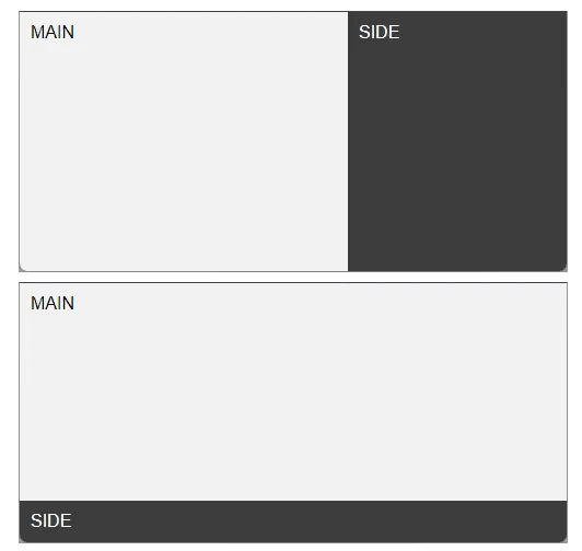
(1A) THE HTML
<div id="main">MAIN</div>
<div id="side">SIDE</div>
Main content to the left, sidebar to the right.
(1B) THE CSS
/* (A) BIG SCREEN - 2 COLUMNS LAYOUT */
body {
  display: flex;
  padding: 0; margin: 0;
  min-height: 100vh; /* optional */
}
#main { flex-grow: 1 …
basic beginners big css designs flex html magic padding responsive sidebar simple webdev
More from dev.to / DEV Community
Jobs in AI, ML, Big Data
Software Engineer for AI Training Data (School Specific)
@ G2i Inc | Remote
Software Engineer for AI Training Data (Python)
@ G2i Inc | Remote
Software Engineer for AI Training Data (Tier 2)
@ G2i Inc | Remote
Data Engineer
@ Lemon.io | Remote: Europe, LATAM, Canada, UK, Asia, Oceania
Artificial Intelligence – Bioinformatic Expert
@ University of Texas Medical Branch | Galveston, TX
Lead Developer (AI)
@ Cere Network | San Francisco, US