all AI news
Four Types of Bar Charts in Python - Based on Array Data
March 14, 2024, 10 a.m. | Luca Liu
DEV Community dev.to
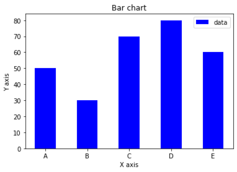
Simple bar chart based on an array in Python
import matplotlib.pyplot as plt
import numpy as np

x = np.array(['A', 'B', 'C', 'D', 'E'])
y = np.array([50, 30, 70, 80, 60])

plt.bar(x, y, align='center', width=0.5, color='b', label='data')
plt.xlabel('X axis')
plt.ylabel('Y axis')
plt.title('Bar chart')
plt.legend()
plt.show()
Stacked bar chart based on arrays in Python
import matplotlib.pyplot as plt
import numpy as np
x = np.array(['A', 'B', 'C', 'D', 'E'])
y1 = np.array([50, 30, 70, 80, 60])
y2 = np.array([20, 40, 10, …
array beginners center charts color data import matplotlib numpy programming python show simple tutorial types
More from dev.to / DEV Community
Jobs in AI, ML, Big Data
Data Architect
@ University of Texas at Austin | Austin, TX
Data ETL Engineer
@ University of Texas at Austin | Austin, TX
Lead GNSS Data Scientist
@ Lurra Systems | Melbourne
Senior Machine Learning Engineer (MLOps)
@ Promaton | Remote, Europe
Senior Data Engineer
@ Quantexa | Sydney, New South Wales, Australia
Staff Analytics Engineer
@ Warner Bros. Discovery | NY New York 230 Park Avenue South